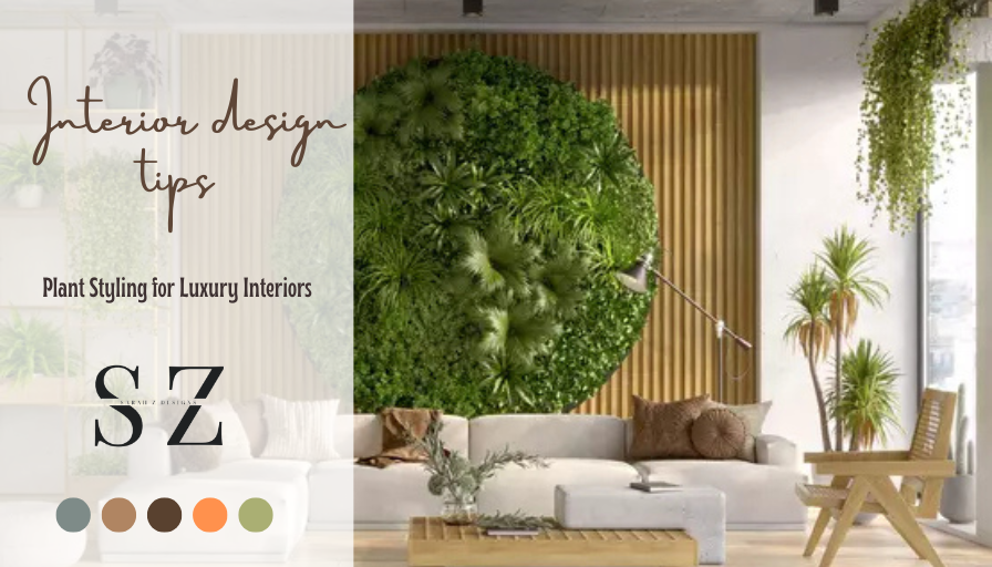
Plant Styling for Luxury Interiors: Scale, Pots, and Placement—Core Principles
Scale and Proportion
In luxury interiors, plant styling begins with scale. Match the visual weight of foliage to the architecture: tall, sculptural trees (e.g., fiddle-leaf, olive, strelitzia) anchor rooms with 10’+ ceilings, while broad, low specimens ground expansive seating layouts. Aim for a height-to-furniture ratio that sits comfortably between one-third and two-thirds of the adjacent piece, preserving negative space around canopies and art. Layer heights—canopy, mid, and ground level—to create depth without clutter, and use asymmetrical balance so a single statement plant can counter a large credenza or fireplace rather than mirroring it. In compact spaces, cluster two to three slender forms instead of one bulky mass to keep sightlines open and luxe finishes in view.
Pots, Finishes, and Details
The right planter elevates plants to furniture status. Choose vessels that are 2–4 inches wider than the grow pot for clean lines and root comfort, and favor matte stoneware, honed marble, patinated metal, or finely textured composites that echo the room’s hardware and stone. Keep palettes tight—tone-on-tone planters with subtle texture read more refined than high contrast—and let one sculptural pot take center stage per zone. Use cachepots with liners to conceal nursery containers, ensure hidden saucers or reservoirs to protect floors, and consider plinths or pedestals to fine-tune eye level. In large rooms, repeat a planter finish once or twice to create continuity, and specify concealed castors on oversized pieces for effortless reconfiguration.
Placement, Light, and Flow
Placement should honor both light and circulation. Position statement plants where natural light skims foliage—beside but not blocking windows, near reflective surfaces, or at the terminus of key sightlines such as entry vistas and corridor ends. Flank fireplaces or consoles with staggered heights instead of strict pairs to keep the look contemporary, and maintain 3–6 inches from walls to prevent scuffing and allow crowns to breathe. Avoid HVAC blasts, door swings, and TV glare; instead, use greenery to soften corners, frame art, and quiet acoustics around hard finishes. In open plans, deploy plants to subtly zone areas: a tall, airy specimen can screen a workspace without feeling heavy, while low, wide arrangements on dining buffets add presence without interrupting conversation-level sightlines.
Proportion Rules: How to Size Plants and Pots to Furniture and Room Scale
Getting plant proportions right starts with the room’s overall scale. Use the rule of thirds as a quick guide: aim for foliage or plant groupings that occupy about a third of the vertical field between floor and ceiling, or a third of the wall section they’re anchoring. In compact rooms, choose slimmer silhouettes and keep generous negative space around foliage so the plants don’t overpower furniture lines; in larger rooms with higher ceilings, bolder forms and taller specimens maintain visual balance. Always size by the plant’s mature height and spread, not the nursery tag today, so proportion stays intentional as it grows.
Match plants to furniture scale by echoing height lines and visual weight. Beside sofas and armchairs, floor plants should visually “talk” to the top of the sofa back, a floor lamp, or the curtain rod line, so the composition reads as one cohesive vignette rather than separate elements. On consoles, sideboards, and media units, keep foliage comfortably below the midpoint of nearby art or mirrors to preserve sightlines and let wall decor remain the focal point. For coffee tables and nightstands, select compact canopies that sit well within the vertical space between the surface and your eyeline when seated or reclining, so the plant complements—not competes with—function.
Right-size the container as carefully as the plant. For tabletops and shelves, a planter should feel subordinate to the furniture: a practical rule is to keep pot diameter to a visually modest fraction of the usable surface so there’s breathing room around it (think “object, air, object” rather than a pot edge-to-edge). Floor planters can be larger to anchor tall foliage, but balance visual weight by coordinating pot width and material with the heft of nearby furniture legs, bases, or frames. Tall, narrow plants often look best in slimmer, elevated planters to extend vertical lines, while broad-leafed or fountain shapes read cleaner in wider, lower vessels that echo their spread.
When styling groups, mix heights to build a proportional “stair step” toward the room’s dominant line (window header, mantel, or art centerline) and maintain negative space equal to the largest pot so the arrangement breathes. Use stands or stacked books to fine-tune elevation until foliage caps align with adjacent surfaces or decor anchors. In tight circulation zones, keep planters narrow and foliage pulled inward so pathways remain visually and physically clear, and let the tallest plant sit where a floor lamp would—corners or sofa ends—so the scale supports, not fights, the furniture layout.
Room-by-Room Placement Guide: Entryway, Living, Dining, Bedroom, and Bath
Entryway: Anchor the space with a slim console or bench that defines the drop zone without blocking the door swing or sightlines. Place wall-mounted hooks or a rail near the door to catch daily essentials, and use a mirror at eye level to expand light and serve quick check-ins before heading out. Keep floor space clear by tucking baskets beneath seating and positioning a durable runner to guide traffic straight through without tripping hazards.
Living Room: Arrange seating to encourage conversation and a clear path from entry to exits, centering pieces around a focal point such as a fireplace, media unit, or large window. Float the rug so front legs of sofas and chairs sit on it, visually unifying the zone. Balance tall items like bookcases or plants opposite heavier seating to avoid a lopsided feel, and place task and ambient lighting at varying heights to eliminate glare while brightening corners.
Dining Room: Center the table in the room or beneath the primary light source, leaving comfortable circulation around pulled-out chairs. Position a sideboard or cabinet along the longest wall for serving and storage, with art or a mirror hung to reflect light and expand the space. Ground the setting with a rug sized to remain under chairs when they’re in use, and keep table decor low so diners maintain clear sightlines across the table.
Bedroom and Bath: In the bedroom, make the bed the focal point on the main wall and scale nightstands to the mattress height for easy reach. Keep dressers and wardrobes on uninterrupted walls to allow full drawer swing, and place soft lighting at both sides of the bed for layered comfort. In the bath, mount the mirror above the vanity for proper task lighting, keep frequently used items within arm’s reach yet off the counter with wall shelves or recessed niches, and position towel hooks or bars just outside wet zones so linens stay dry while still accessible.
Luxury Planter Materials & Finishes: Stone, Ceramic, Metal, and Lacquer
Stone Planters
Natural stone planters—from limestone and travertine to granite and marble—deliver timeless luxury with distinctive veining, organic texture, and substantial weight that anchors entrances and terraces. Premium stone finishes such as honed matte, hand-polished gloss, or lightly sandblasted surfaces accentuate depth and resist everyday wear while developing a refined patina over time. Sealing helps limit moisture intrusion and staining, preserving color integrity in high-traffic or outdoor settings. Choose stone for enduring elegance, thermal stability, and a sculptural presence that complements both contemporary and classical landscapes.
Ceramic and Porcelain Planters
Ceramic planters offer artisanal character, with high-fired bodies and sophisticated glaze options—satin, matte, crackle, or high-gloss—that add luminous color and subtle texture. Porcelain, prized for its low porosity and crisp edges, provides a sleek, modern profile ideal for minimalist interiors and refined patios. Quality glazing enhances moisture resistance and colorfastness, while footed bases and drainage-ready designs improve plant health and longevity. Opt for ceramic or porcelain when you want vivid color depth, smooth silhouettes, and gallery-worthy surface finishes.
Metal Planters
Metal planters balance architectural lines with exceptional durability, ranging from powder-coated aluminum for lightweight corrosion resistance to brushed or mirror-polished stainless steel for high-impact shine. Weathering steel (often called Corten) develops a warm, protective patina, while bronze or brass introduce rich metallic tones suited to luxe hospitality or boutique retail spaces. Advanced powder-coat finishes expand color palettes and improve UV and abrasion resistance, and double-wall or insulated constructions help moderate root temperatures in full sun. Select metal for crisp geometry, slim profiles, and a modern, performance-driven finish.
Lacquered Finishes
Lacquer planters deliver a couture, high-gloss statement with a mirror-like surface that elevates foyers, galleries, and premium retail environments. Multi-layer lacquer systems—with carefully sanded color coats and UV-stable clear coats—create exceptional depth and a flawless sheen in bold hues or classic piano black and white. These high-gloss finishes pair best with sleek, contemporary forms and benefit from gentle care: microfiber wiping and non-abrasive cleaners maintain clarity and luster. For outdoor use, look for lacquered pieces engineered on moisture-resistant cores and finishes rated for UV exposure to preserve color and gloss.
Designer Styling Formulas and Common Mistakes to Avoid for a Luxe Look
Designer styling formulas that consistently deliver a luxe look start with color and structure. Try a tonal triad: three shades from the same color family layered head-to-toe (light, mid, dark) to create depth without visual noise. Add the third-piece rule—a tailored blazer, vest, or longline coat—to sharpen the silhouette instantly. Another failsafe is the column of color (matching top and bottom) topped with a contrasting outer layer for vertical length and polish. Keep accessories restrained: one hero piece (belt, bag, or cuff) that echoes your palette or metal tone.
Elevate texture and fabric deliberately. Build a texture pyramid: matte foundations (fine wool, cotton twill) + a subtle-sheen layer (silk, satin) + a single high-shine accent (patent, polished hardware) to signal luxury without glare. Maintain metal harmony by sticking to one finish (all gold or all silver) across jewelry, belt buckles, zippers, and bag straps. For visual cohesion, repeat a texture twice—like a smooth leather belt mirrored by sleek leather footwear—to connect the look.
Proportion is the quiet key to refinement. Use the structured + fluid formula: pair a tailored piece (blazer, crisp shirt) with a softer counterpart (wide-leg trouser, bias skirt) for balance. Apply the rule of thirds by cropping or tucking tops to hit at one-third of your overall length, letting bottoms claim the remaining two-thirds for legs-for-days. Coordinate hem-to-heel: wide hems with substantial shoes, slim hems with sleeker profiles. Scale accessories to your frame—medium bags and moderated jewelry read more luxurious than extremes.
Avoid common mistakes that cheapen a luxe look: over-logoing or stacking multiple statement items that compete; poor fit (sagging shoulders, dragging hems, gaping buttons) that undermines even premium pieces; clashing metals and mixed hardware finishes; mismatched blacks or starkly different whites within the same outfit; ignoring fabric care (wrinkles, lint, pilling, scuffed shoes); and trend overload without a classic anchor. Watch underpinnings—visible lines or wrong bra styles disrupt clean lines—and respect seasonality by aligning fabric weights so the outfit looks intentional, not improvised.